Web App
Trial-changing results in days, not months.High-Dimensional Data, Simplified Analysis
The Teiko web application transforms the complex process of analyzing high-dimensional cytometry data into an intuitive, customer-focused digital experience. Designed to simplify immune cell measurement for clinical trials, our application offers immune insights and data-driven answers without the need for extensive internal resources.
DIY Complexity
Rough answers that take months
Cytometry workflows are demanding: manual sample handling, intricate instrument tuning, spreadsheet-based analysis, and countless hours are required to produce actionable data and results. The status quo for cytometry is a “do-it-yourself” approach, full of roadblocks that impact data quality, results, and timelines.
Teiko’s Simplicty
Clean results in weeks
With Teiko, all that changes. Our web app takes you from sample collection to insightful analysis without the hassle. No more DIY; just high-quality immune cell profiling, delivered through a simple, interactive web app.
Intuitive navigation of your “immune tree”
In the sample overview page, you’ll see the immune lineage mapped out, from top to bottom. You can see which markers are part of each branch of the tree, and group subsets of cells by cell type. Additionally, you can see which functional markers have been analyzed by cell type.
Reports, like Panel Verification and Sample and Gating QC Reports, will be stored here.
You’ll have access to your Gating Scheme, which can be displayed and downloaded.
Gated Analysis
Interactive visualization of immune composition by subject
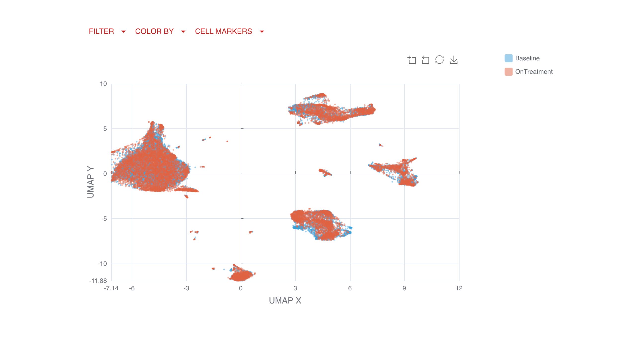
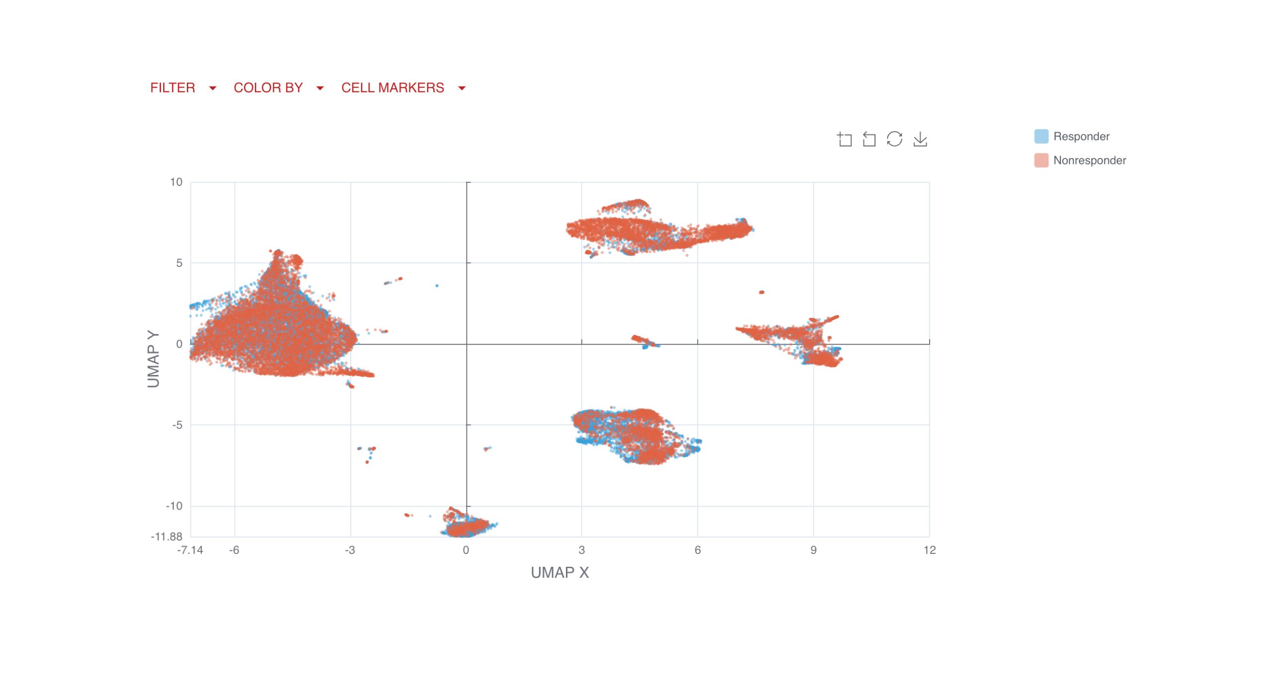
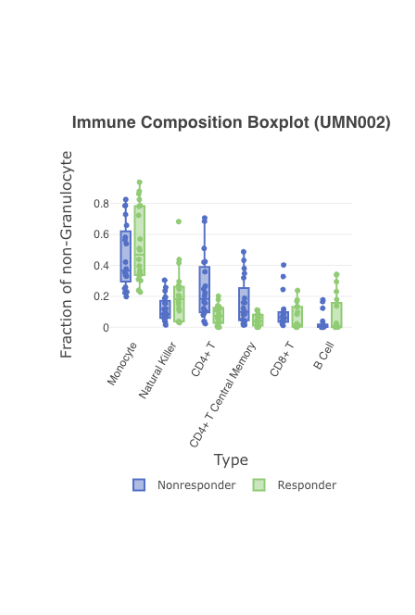
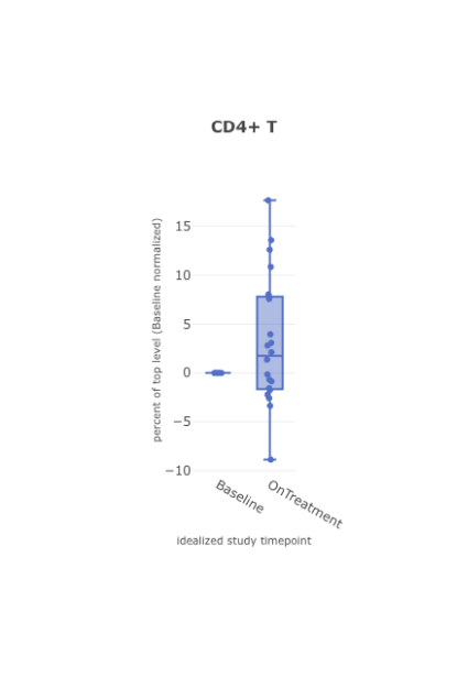
Get a birds-eye view of your data. Analyze your specimens by pre-specified groups, i.e. dose or response, in easy to read boxplots. Use advanced filtering to narrow to a specific timepoint, like baseline, or on-treatment.
Compare by response
Normalize to baseline
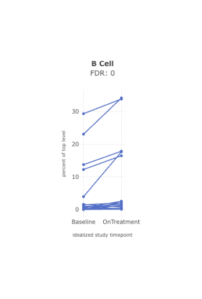
Compare across timepoints
View frequencies of specific immune cell populations
When viewing immune composition boxplots or stacked bar charts for high-dimensional cytometry data, you can display cell types as fractions of their chosen top-level population: T cells, B cells, monocytes, etc.
Further, users hover over individual samples to display the cell counts for each cell type and its top-level population.
Check it out:
Group Similarity
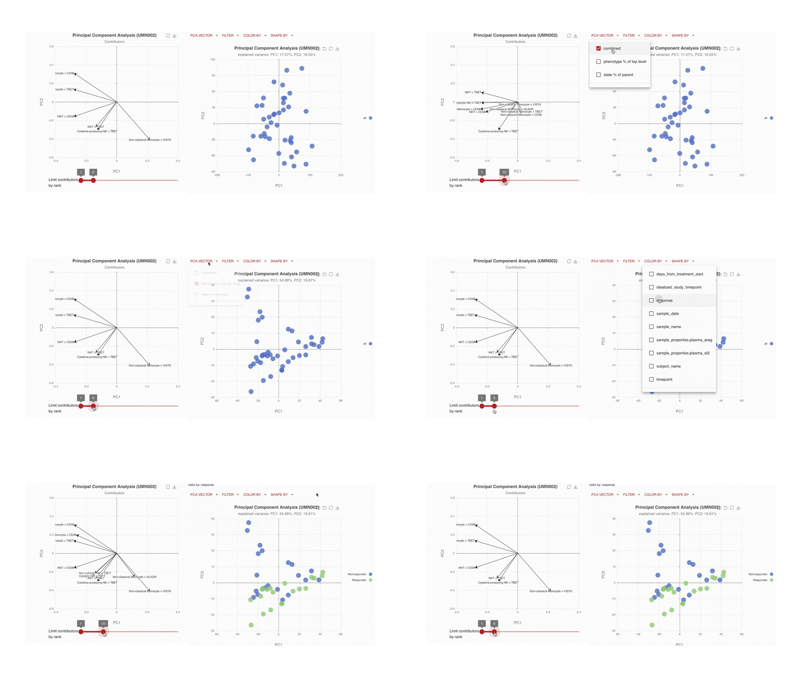
Visualize the main drivers of differences in the high-dimensional data through Principal Component Analysis (PCA). Use the PCA contributors plot to identify which markers are driving the shape of your data.
Immune changes: by time, by endpoint
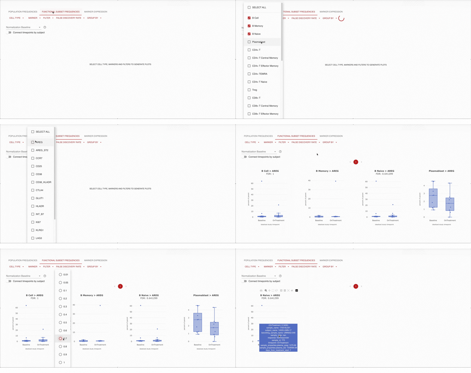
Dive into detail by cell type.Pick a set of cells you are interested in, and track the proportions of those cells across time or specified endpoint (i.e. dose). For example, are B cells increasing over time? Apply statistical tests to confirm that you are seeing statistically significant results.
Access, adjust, and visualize your data with ease. Our platform allows you to dive into every detail—compare immune cell subsets, explore phenotypes, and identify critical immune markers. Whether it’s manually gated or machine-learning-derived unsupervised clustering, the web app has the tools you need.
Unsupervised Analysis
As part of our unsupervised analysis pipeline, all cells are clustered, with low-frequency and low-quality clusters removed. An initial automatic cluster annotation assignment is performed, followed by a quality control process where our bioinformatic scientists refine and improve the cluster name assignments.
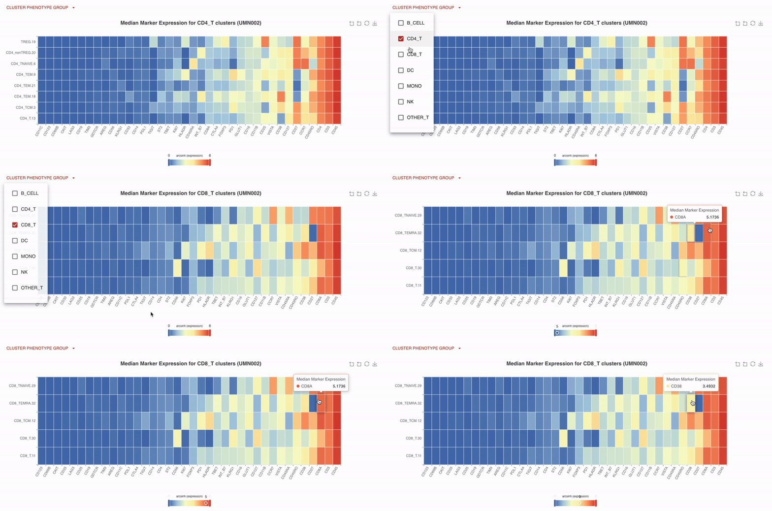
With Teiko’s advanced machine learning capabilities, searching up to 2.2 trillion potential cell subtypes, you can uncover rare or unexpected signatures that may be overlooked by manual gating. Heatmaps are available to compare clusters side by side, making it easy to identify patterns and differences.
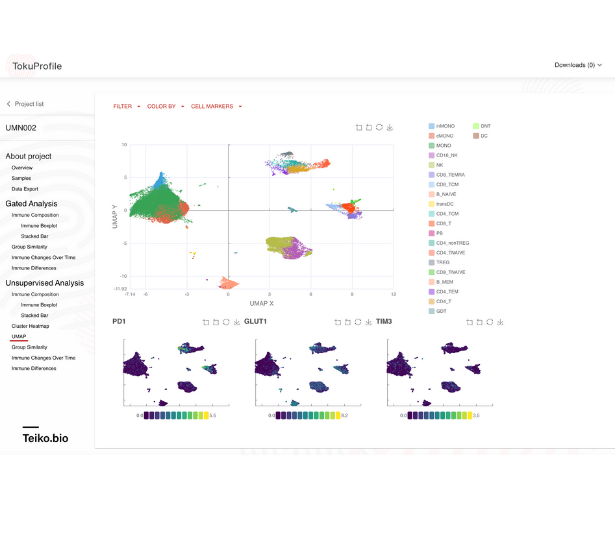
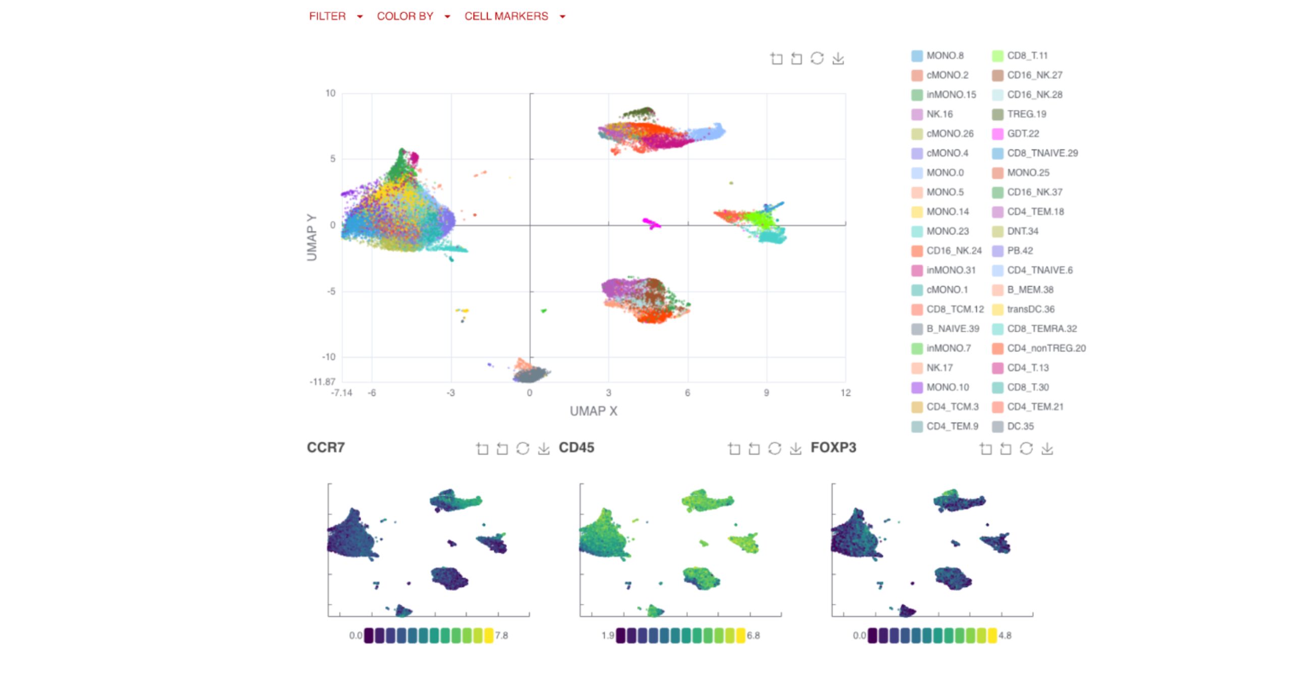
UMAP (uniform manifold approximation projection) plots provide a detailed visualization of your data, with clusters and cell types clearly labeled for easy interpretation.
You can also compare clusters by endpoints, applying the same logic and filtering options available in the gated analysis to explore key changes over time or by response group.
